Top+
Premium Drupal 8 theme Documentation
A modern Drupal 8 mega-theme with custom modules and 200+ theme settings for presenting content in the most effective manner.
Contents
2.1.1. Install as a full Drupal distribution (with all features as seen in demo)
2.1.2. Install as a simple theme over existing Drupal site
2.1.3. Install over existing Drupal installation, with the special features
3.3.1.1. Change the Breadcrumb separator
4.1.3. Entity Reference Revisions
4.3. Automated image generation and handling
7.4. Fancy Linked Images block
7.6. Featured Linked Text Tiles block
9.4. Publish a post to the slideshow
9.4.1. Article, Showcase, Product or Service
9.5. Create new instances (clones) of existing blocks and assign them to regions
9.5.1. Remove blocks from regions
9.6. Allow blocks to be referenced through custom block type fields
9.7. Add a new tabs block (Tabs block custom block type)
9.8. Add a new Fancy tabs block (FancyTabs block custom block type)
9.9. Add a new Background Image block
9.10. Add a new Fancy Linked Images block
9.11. Add a new Google map block (Google map custom block type)
9.12. Add a new Nodes Slideshow
9.13. Add a new Featured Linked Text Tiles block
9.14. Add a new Main Slideshow block
9.15. Add a new Media Tabs block
9.16. Add a new Video Gallery block
9.17. Add a new Dropdowns block
9.18. Add a new Icon features block
9.19. Add a new Background Video Block
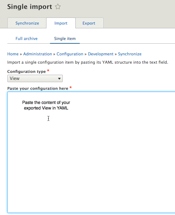
9.20. How to modify the Front Page Background feature
9.20.1. How to change the Front Page background image
9.20.2. How to modify the Front Page background image configuration
9.21. Use @font-your-face module to apply any font to your theme
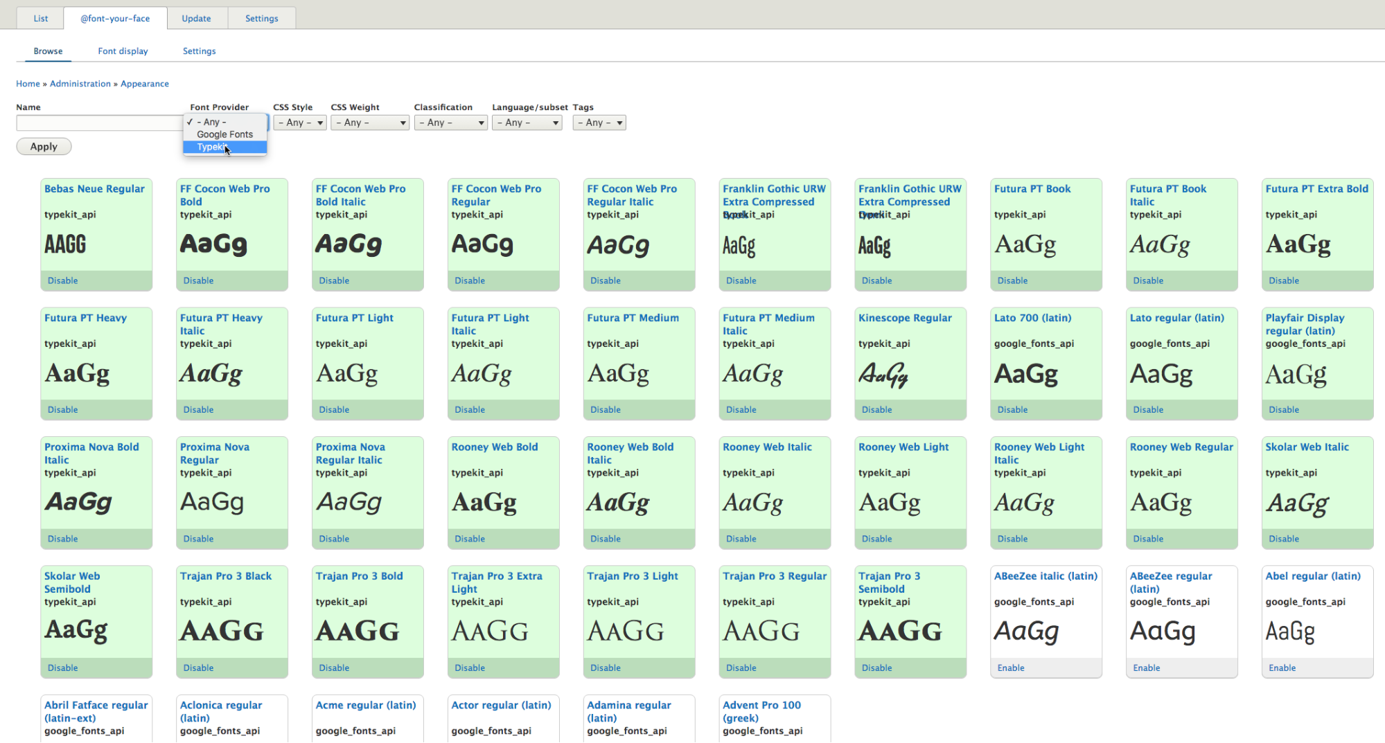
9.21.1. How to add fonts from a premium font library
You can always find the latest and most up to date version of this document in the following URL:
http://support.morethanthemes.com/customer/portal/articles/2911185
The Top+ for Drupal 8 product pack contains the following:
Theme installation guidelines for Drupal 8.
There are two main ways to use Top+: (1) install as a full-featured Drupal distribution, and (2) apply as a simple Drupal theme, on top of an existing Drupal 8 core installation.
At the end of the installation process documented below you will be able to log in to your Drupal site as administrator. To login, once you install, go to /user/login url and use the following credentials: u: admin, p: password |
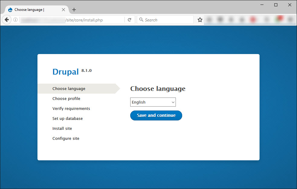
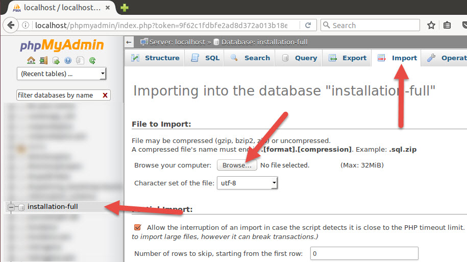
To install Top+ for Drupal 8, with the demo content and the full functionality, including Content types, Slider(s), Views pages and blocks, and special layouts, please follow the steps below.
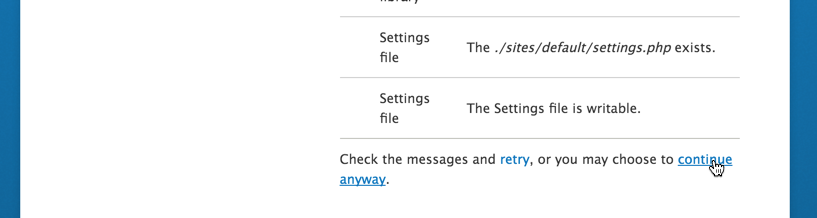
If confronted with any warnings, click to continue with installation.
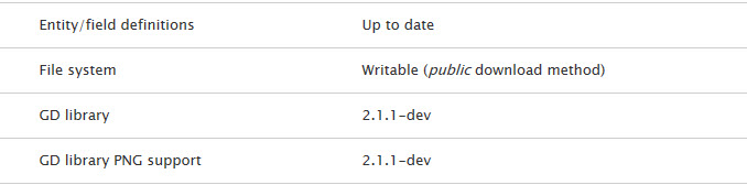
Other errors may exist and should also be taken care of.
[1] How to find your Apache server path: if you are deploying online, your hosting provider should be able to provide you this. If you are deploying locally, it will be where your XAMPP or MAMP installation is configured to look into (e.g.: htdocs, in the case of MAMP on Mac OS X).
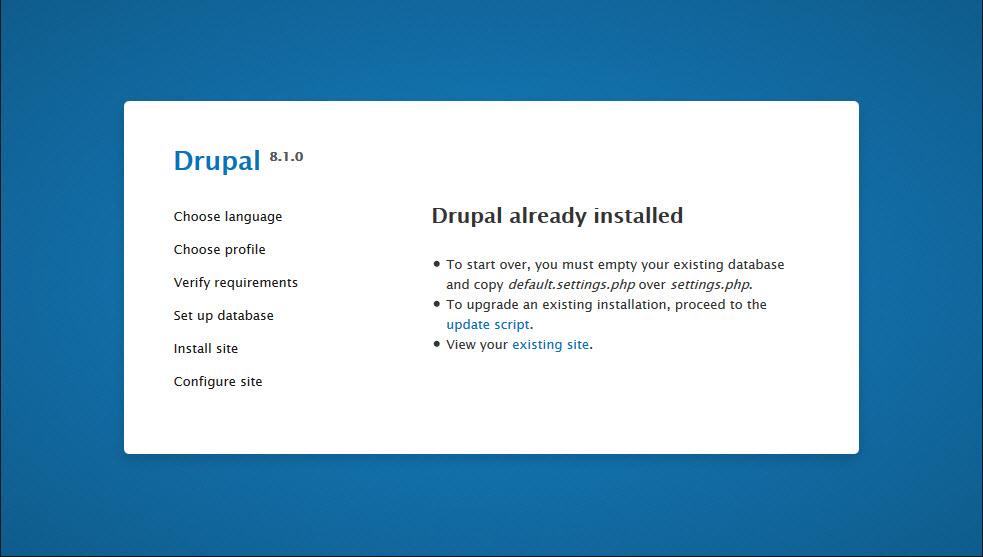
Important notice: It is strongly recommended that you execute the instructions below on a cloned instance of your production site. This is the safest way to handle this, ensuring that your production site remains unaffected if you make any mistake in any of the steps below.
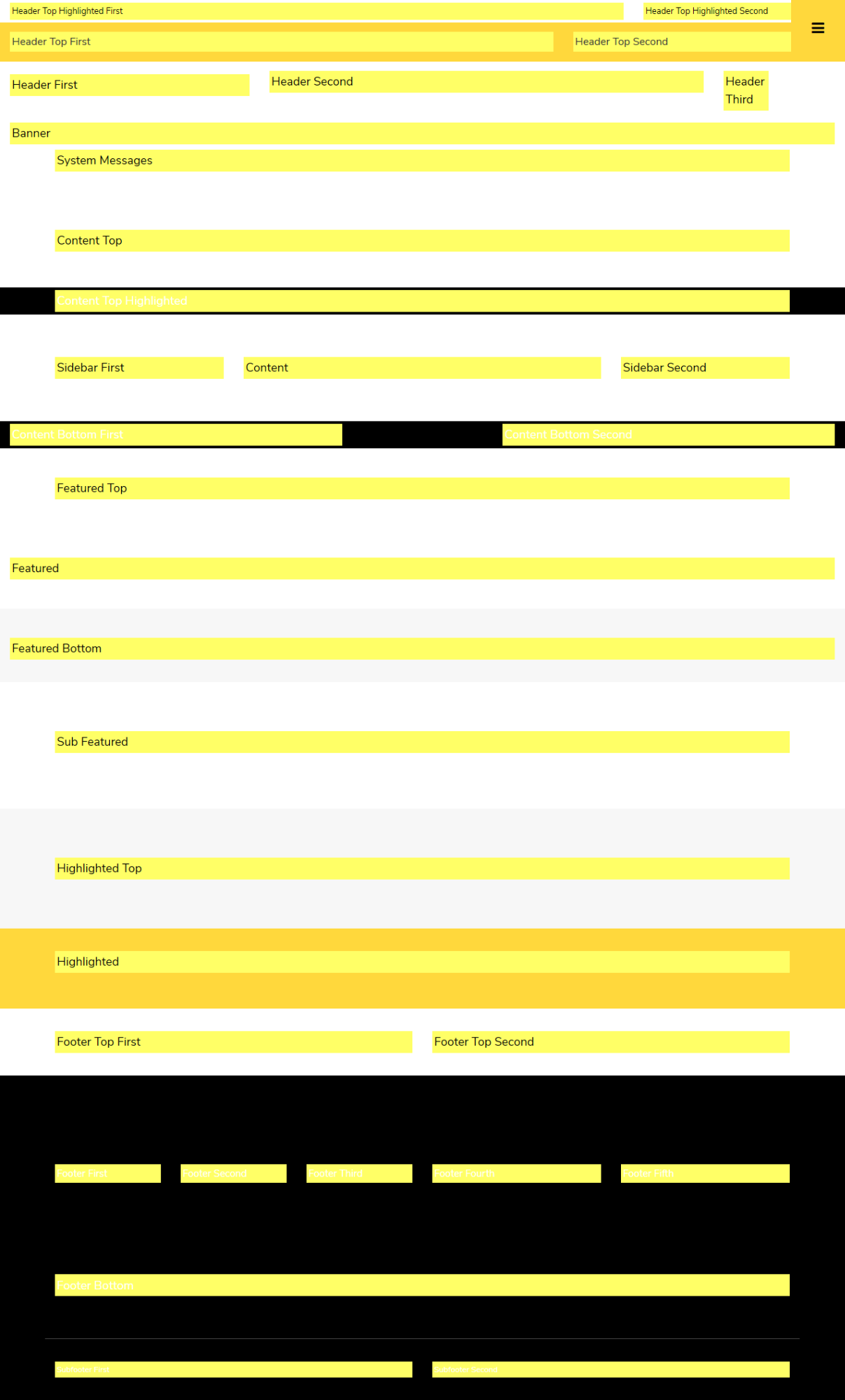
Top+ incorporates the 33 regions shown below, to help you take advantage of the flexibility Drupal regions provide.
Top+ includes a complete Style Guide with rules and styling for typography at the following URL in your installation:
To help you get up to speed with developing your Drupal site, Top+ also includes a detailed Shortcodes page, with the most common UI elements you would need, themed, at the following URL in your installation:
Top+ comes with a great collection of theme settings, so that you can customize the looks, layout, interaction and functionality of your site through the Drupal admin user interface, without having to mess with the code (although that is always perfectly possible).
The theme comes with 12 main groups of theme settings:
All theme settings are available under the Appearance section, in the Drupal admin environment:
Home » Administration » Appearance » Appearance settings
Important notice:
With all theme settings, remember to hit “Save configuration” when you change something, to see your edits reflected on the site running Top+.
A selection of theme settings affecting the site globally.
The theme settings are explained in detail below, point-by-point.
Change the Font Awesome character that will be the breadcrumb separator in your site. The default is “fa-angle-right”, but you can also use any Font Awesome icon that better suits your needs.
Enable or Disable the display of the Scroll to top button.
Change the FA icon that is displayed over the button. The default text is “fa-angle-double-up”.
Choose how to load the Bootstrap library. If you select "Local" make sure that you download and place Bootstrap folder into the root theme folder (topplus/bootstrap).
Select the Color Scheme you wish to use and disable or enable the full-page border.
Top+ comes in multiple built-in curated color schemes to help you style your site according to your preferences.
Important notice:
All color schemes are developed in CSS3 code, without proprietary graphics or software and are therefore also endlessly customizable as detailed in the section “Customize the theme”, further below.
Enables you to choose
for your Top+ running site, as shown below, so as to enhance the user experience for your visitors.
With regard to animations in particular, you can choose among a number of built-in animation movements.
If you want to completely remove all animations, you can easily do so, by unchecking the “Animations” option at the top of this tab, then hitting “Save configuration”
The Front page of Top+ can display a background image behind all the Header and Banner regions.
The theme settings in this category allow you to enable/disable this feature and also set the opacity of the colored overlay.
Top+ comes with the following well-known, widely used sliders:
(credits and links are provided in the introductory section)
Depending on your preferences, you can choose to use either of the two sliders, or to have one on certain pages and the other on others, as explained in the “Views Blocks” Section. Here, in the Slideshow tabs from the theme settings you can adjust the settings of the slider you use.
The settings you can choose among include
Top+ incorporates some of the most popular accessibility features for your visitors, like
Not only these give your Drupal 8 site a sense of professionalism, but they are also essential for your visitors that are reading your content.
This specific theme settings allows you to apply the normal (Wide) layout of the theme or change it to boxed.
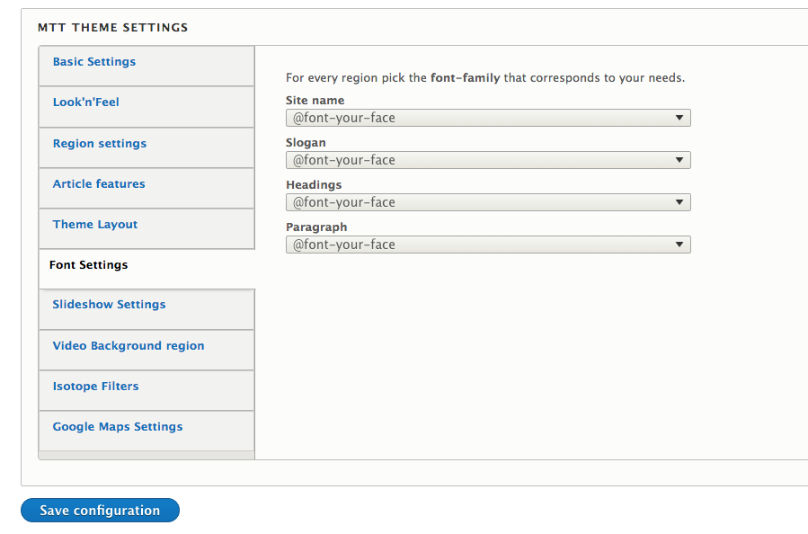
Top+ comes with multiple built-in curated font options, to help you style your site according to your preferences. Based on design quality and the number of characters and language coverage, we have selected several dozens of the most high quality freely available fonts, so you don’t have to lose time experimenting yourselves.
Advice:
It’s generally considered a good typographic advice to use as few fonts as possible and try to provide a visual hierarchy by using HTML tags, spacing and proper line-height, which are all built into the theme.
Because sometimes, though, you may want to use more than one fonts, the typographic structure and options of the theme are broken into four main categories, so you can customize different fonts for each:
Important notice:
All typographic selections are developed in CSS3 code, without commercial fonts or software and are therefore also endlessly customizable as detailed in the section “Customize the theme”, further below.
If the font you wish to use is not available through these theme setting, you could use the included @font-your-face module to import and use any font you wish. You can find out more on how to use this at the corresponding how to topic below (9.21).
Top+ allows you to link menu items to specific regions of the page. You can see an example of this feature in the following page:
The theme setting options of this tab allows you to set the ID attributes of each region so that you can link to this section through the menu.
You can also set the offset for the scroll to feature. This should be set to be equal to the height of the fixed header.
Top+ comes with the Isotope views as mentioned in the corresponding section below (6.5).
You can change the layout of these views (as initialized in the js implementation) as well as the text for the filter option that displays all the items in the view.
As of June 22 Google has changed their policy regarding the standard plan of Google Maps API. Keyless access to the API is no longer supported.
We have therefore implemented a theme setting to add your own Google Maps API key in order to make authenticated calls and display the Google Map.
Please generate a browser API Key through the documented procedure and input it into the “Google Maps API Key” field. Our implementation will include this while requesting information from the Google Maps API.
The key that comes bundled with the theme is only valid for use in localhost so you will have to create your own once you move to your production server.
Overview of the Drupal modules used in Top+:
Top+ makes use of the Superfish module and the corresponding library to display multi-level menus. To use, simply add the corresponding superfish block to the region you want and Top+ will style the menu accordingly.
The Superfish module also implements a mobile menu that is configured to activate in narrow screen widths (configured through the block settings).
This module is used to provide more UX friendly options to use as filters in views. These options are available through the corresponding options in these views
This module is a requirement of the “Paragraphs” module.
This module allows you to import external fonts hosted on Google Fonts, Font Squirrel, Adobe etc. It is not used in the default installation of Top+ however we have prepared the configuration required for you to apply your fonts to specific Top+ elements.
This module allows you to define collections of fields to be used within other entities. For example the Fancy tabs custom block is powered by a paragraph field that contains a Title field, a Subtitle field as well as the referenced block.
This module provides a field that is used in different content types that provides video (Youtube & Vimeo) support.
This module is used to group similar fields together in order to provide better Content editing experience.
This is a custom module by MoreThanThemes that provides features of the Cookie Consent Javascript library - https://cookieconsent.insites.com/
You can configure the content and the messages of this features through:
admin/config/mt_cookieconsent
This is a custom module by MoreThanThemes that provides features of the “The Final Countdown” jQuery library: http://hilios.github.io/jQuery.countdown/
You can configure the content and the messages of this features through:
admin/config/mt_countdown
Under the hood, Top+ comes with pre-configured image presets ready to be used.
All the content types make use of this feature and produce all necessary thumbnails and other derived images automatically.
To make use of the automated image generation and handling, simply upload your images and Top+ will use those for the Front Page and any other place where a derived image is needed.
Top+ comes with seven, special built-in Content types:
Of course, Top+ also supports the default Drupal content types: Article, Basic page etc.
A "Benefit" post is ideal for creating and displaying Benefits of your offerings to clients. A Benefit can be displayed in the front-page slideshow. It also comes with the capability of attaching an image which is automatically adjusted to fit into the website layout. What’s particularly cool about a Benefit post, is that it provides the ability to attach a series of images, thumbnails of which are automatically created and adjusted to fit into the website layout. Lastly, a Benefit post enables free tagging (just like labels), helping you make the most from the built-in taxonomy system.
A Product post is ideal for creating and showcasing your products. It comes with the option to be featured at the front page slide show. It also provides the ability to attach one main product image, which is automatically adjusted to fit into the website layout. Further to that, what’s a particularly great time-saver about a Product post, is that it provides the ability to attach a series of images, thumbnails of which are automatically created and adjusted to fit into the website layout, wherever needed.
A Service post is ideal for creating and displaying services. It has the option to be displayed into front page slide show. It provides the ability to attach an image which is automatically adjusted to fit into the website’s layout. What’s particularly cool about a Service post, is that it provides the ability to attach a series of images, thumbnails of which are automatically created and adjusted to fit into the website layout. Service post enables free tagging (just like labels), taking the bests from the taxonomy system.
A Showcase post is ideal for creating and displaying showcases. It has the option to be displayed into front page slide show. It provides the ability to attach an image which is automatically adjusted to fit into the website’s layout. What’s particularly cool about a Showcase post, is that it provides the ability to attach a series of images, thumbnails of which are automatically created and adjusted to fit into the website layout. Showcase post enables free tagging (just like labels), taking the bests from the taxonomy system.
A Slideshow entry is ideal for creating announcements and/or commercial banners, as well as other front-page messages for your website. Use it to promote any page of your website or URL into the front page slideshow. The slideshow entry can carry a title, a teaser and an image linking to an internal path or external link.
The Team member post is ideal for creating a page for each of your team members. Along with a description of your team member’s position, responsibilities and qualifications, it provides the ability to attach an image, which is automatically adjusted to fit into the website’s layout. And what’s great about Team member posts, is that they are all collected under the “About us” page.
The Testimonial entry is perfect to showcase the words of love from your users and customers. Use it to easily publish testimonials on your site. A special View Block and a View Page are already configured to show them off perfectly.
One of the most powerful features of Drupal is the Views module, which in Drupal 8 is anymore in core.
Further to the default Views blocks, like
Top+ comes with many Views implementations, including pages and blocks, that enable you to automate the collection and presentation of information throughout the site. These Views are listed under
/admin/structure/views
Every one of those is also editable via the front-end interface, when logged in as Drupal admin, by clicking the corresponding action link, when hovering, as shown below:
The base articles view collects and displays articles as a list of teaser view modes. This view is accessible through the following page
In addition to the view page above there is also the grid version of this view in 2-column, 3-column and 4-column flavors. These views are accessible through
Finally there is also one more version of the articles view that displays article nodes in a simple list style. You can access this under
This view collects and displays benefit nodes. There is also available the view block “Benefits” that collects only those that are tagged as promoted to the front page. The view page can be found at:
This view collects and displays items of the taxonomy vocabulary “clients” in a simple grid of images. The view is accessible through:
There is also available the corresponding view block “Clients carousel” that displays the same items in a carousel slideshow.
This view block collects and displays “Internal banner image(s)” of the active node in a slideshow implemented through Slider Revolution. It is only a visible in node pages that have content in the “Internal banner image(s)” field.
This view consist of 3 different pages that each displays the corresponding nodes in a grid layout with additional Isotope filters at the top. There is one page for each of the “Product”, “Service” and “Showcase” content types.
This view consists of four separate view blocks that each displays the latest nodes of the corresponding content type. There are view blocks available for the “Product”, “Service”, “Article” and “Showcase” content types.
This view collects and displays showcase nodes in a 3 column grid layout. The view page is accessible through:
This view block collects and displays all the taxonomy terms used on the site, sorted from the most to the least used.
Collects and displays the latest products in a pricing table style. There are 2, 3 and 4 column view blocks available. You can also find the corresponding view page under:
Collects and display product nodes with the corresponding style and features. The following flavors are available: 2, 3 and 4 column grid, List of nodes and masonry layout. These views are accessible through:
This view block collects and displays items of the taxonomy vocabulary “Product Tags” as a simple list of labels.
View blocks that collect and display Article, Product, Service or Showcase nodes that are marked as Promoted to the front page. The view blocks are available in 2, 3 and 4-column flavours.
View block that collects and displays nodes that belong to the same collection as the current node. Products that have been tagged with the same Collection term are displayed in this block.
Collects and display Service nodes with the corresponding style and features. The following flavors are available: 2, 3 and 4 column grid and List of nodes a These views are accessible through:
Collects and display Showcase nodes in the corresponding grid style. The available options are 2, 3 and 4 column grid layout available at the following pages:
Also available is an alternative grid style for the showcases of your site. This view can be found under
Collects and displays nodes that are marked as promoted to slideshow. There are 3 different flavours of the slideshow, Boxed, Full screen and Full width. You can see each of these blocks at the corresponding demonstration pages:
Collects and displays “Team Member” nodes in a grid layout or as a list. You can find the corresponding view pages under:
Collects and displays testimonials nodes in a simple and stylish list. There is also available a simple view block that displays the last 2 testimonials as well as Slideshow powered view block that loops through all of them. The view pages are accessible through:
Collects and displays all nodes that have the corresponding video field populated. There is also a view block available that displays the latest 6 items. The view page can be accessed through:
Top+ comes with three, special built-in custom Block types:
This custom block type allows you to create blocks that display a background image as well as other blocks on top of this image.
The background image block behaves similar to a region. You have to upload an image to use it as the background and then reference at least one block to be displayed over this image.
Additionally you can also configure the layout (full-width/fixed-width), the opacity and the color of the overlay.
Note that in order to reference blocks inside a background image block you will have to assign those to the "Hidden Blocks Collection" region (See below). This is required as Drupal will only render blocks that are assigned to a region.
We suggest that you do not restrict the visibility of the referenced block and only configure the visibility of the actual Background image block.
This custom block type allows you to create blocks that display a background video as well as other blocks on top of this video.
The background video block behaves similar to a region. You have to upload a video and an image to use as the background and then reference at least one block to be displayed over this image.
Additionally you can also configure the layout (full-width/fixed-width), the opacity and the color of the overlay.
Note that in order to reference blocks inside a background image block you will have to assign those to the "Hidden Blocks Collection" region (See below). This is required as Drupal will only render blocks that are assigned to a region.
We suggest that you do not restrict the visibility of the referenced block and only configure the visibility of the actual Background video block.
This custom block type allows you to create groups of dropdown elements that display other blocks within.
You can set the trigger icon as well as the block that you wish to display.
This custom block type allows you to create a 3 column layout that displays images that can be linked to any other page or outside URL.
You can choose the link path and text, set a Font Awesome icon and set the title that is displayed below the image.
This custom block type allows you to create blocks that display other blocks in a more stylish tabbed design.
You can choose each tab title, subtitle and the referenced block that you wish to display within the tab.
This custom block displays information in a tiled design that can also be linked to any in site page or external URL.
This custom block type allows you to configure and display a Google map block. You can see this block type used in the contact page.
his custom block displays information in an icon feature style. You can see this block used on the front page.
This custom block allows you to create Slideshow blocks with different content and custom design. It supports all the Views powered slideshow features and provides more flexibility in the editing experience as well as the final result.
This custom block displays tabs that can show a video or image as well as text information. You can also link to any in site page or external URL.
This custom block displays a slideshow of referenced products. You can set specific thumbnail images to be used and reference the product nodes that you want to display.
This custom block type allows you to create blocks that display other blocks in a simple tabbed design.
Simply choose the blocks that you want to display on each tab. Tab titles are set be the referenced block titles.
This custom block type displays youtube or vimeo videos in a gallery slider design. This block is ideal for creating video series presentations that your user can watch in desktop and mobile devices.
With Top+ and Drupal 8 you can create new blocks and place them wherever you want in your site. You can also place multiple instances of those, as well, as described above.
The demonstrate the above-mentioned option, to show you the styling the theme comes with, and also to help you get up to speed with developing your Drupal 8 site using Top+, it comes with the pre-built and preconfigured blocks below:
Important notice:
The above-mentioned built-in and preconfigured blocks are available when doing a full installation of Top+, with the demo content as well. These are not available if you simply install Top+ as a simple Drupal 8 theme.
Your image will automatically be uploaded and resized to fit in the Slideshow. Your post now is part of the front page Slideshow.
Drupal 8 comes by default with a feature that allows you to create new instances of existing blocks and assign those in the theme regions.
In Drupal 8 in order to remove a block from a region you should just delete it from the regions page. If you need to place the block in the future you could follow the above procedure to create a new instance of this block.
In order to be able to reference and display a block though a custom block reference field you should first assign it to a region. We have created the “Hidden blocks collection” region exactly for this reason.
Blocks assigned to this region will not be printed through the theme but will be available to reference through the custom block types and will be displayed based on the custom block visibility configuration.
Blocks that are already assigned to the “Hidden blocks collection” region can be used multiple times through different custom blocks.
The background image that is displayed on the front page of the Top+ distribution is loaded directly from the theme folder. Specifically the image is located under themes/custom/topplus/images/background-image-banner.jpg
In order to change this image simply replace it directly in the theme folder and then clear the Drupal as well as your browser cache.
Top+ comes with pre-defined “Font displays” for you to help you easily apply the font you need.
By default, Top+ comes with built-in support for all fonts from the rich and ever growing Google Fonts font directory.
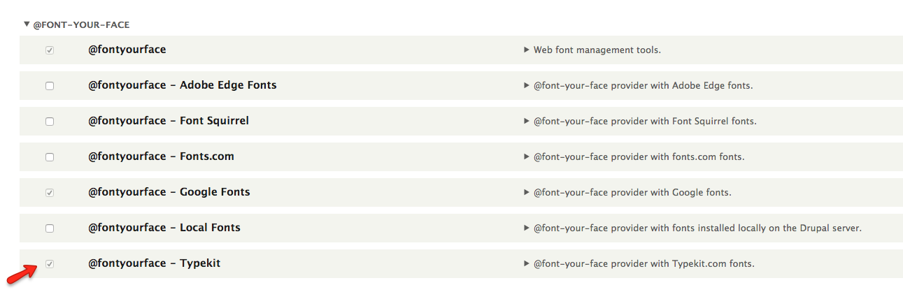
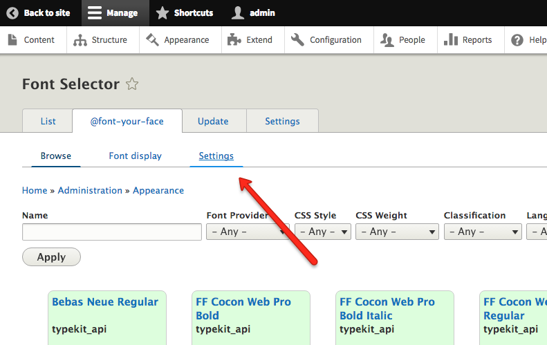
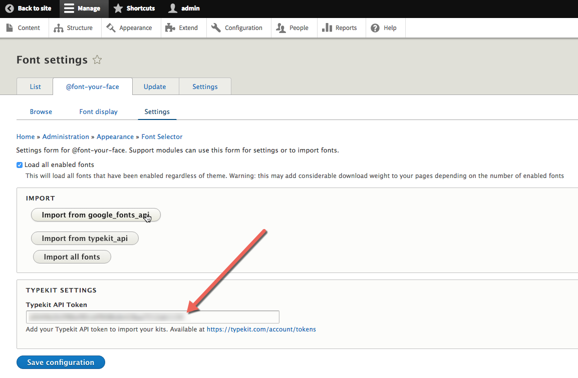
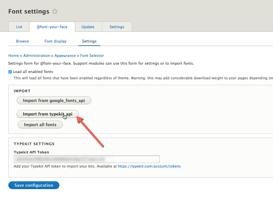
In case you want to add fonts from a premium font subscription service, like Typekit, here’s how to proceed.
The theme style is written in a SMACSS-inspired approach and is very modular. According to this architecture we have added a local css file for each CSS category that overrides the corresponding category CSS rules.
Each of these CSS files is located under the corresponding folder inside the theme folder:
This doesn’t mean, though, that you should not be able to easily customize the site you build with it, as much as you want, even if e.g.: the
you would like to use, is not included in the built-in Theme settings, described above.
In general if you do not have the time to research and understand all this architecture we suggest that you use the css/theme/local-theme.css file for your CSS rules.
The local-theme.css is designed to override the theme settings and styling currently in use. And because it’s a separate file, any CSS that you add in this file leaves the code codebase of the theme intact, so you can safely roll back anytime.
In light of the above local-theme.css is your go-to-file, for customizing the theme with no limits at all.
Initial release
Page of
[1] Requires that you are signed in into your Typekit account.
[2] This will only include the fonts in your Typekit account that you have selected and added to one of your published font kits and not all your fonts in your Typekit account.
[a]+stavros@morethanthemes.com Εδώ τί θέλεις να γράψουμε?
_Assigned to Stavros Kounis_
[b]ότι κα ιπαραπάνω. και αυτό wrapper ενός JS lib είναι
[c]+stavros@morethanthemes.com Είναι ΟΚ? Κάνε resolve αν είναι